Typography Poster
TYPOGRAPHY • POSTER DESIGN • PRINT DESIGN
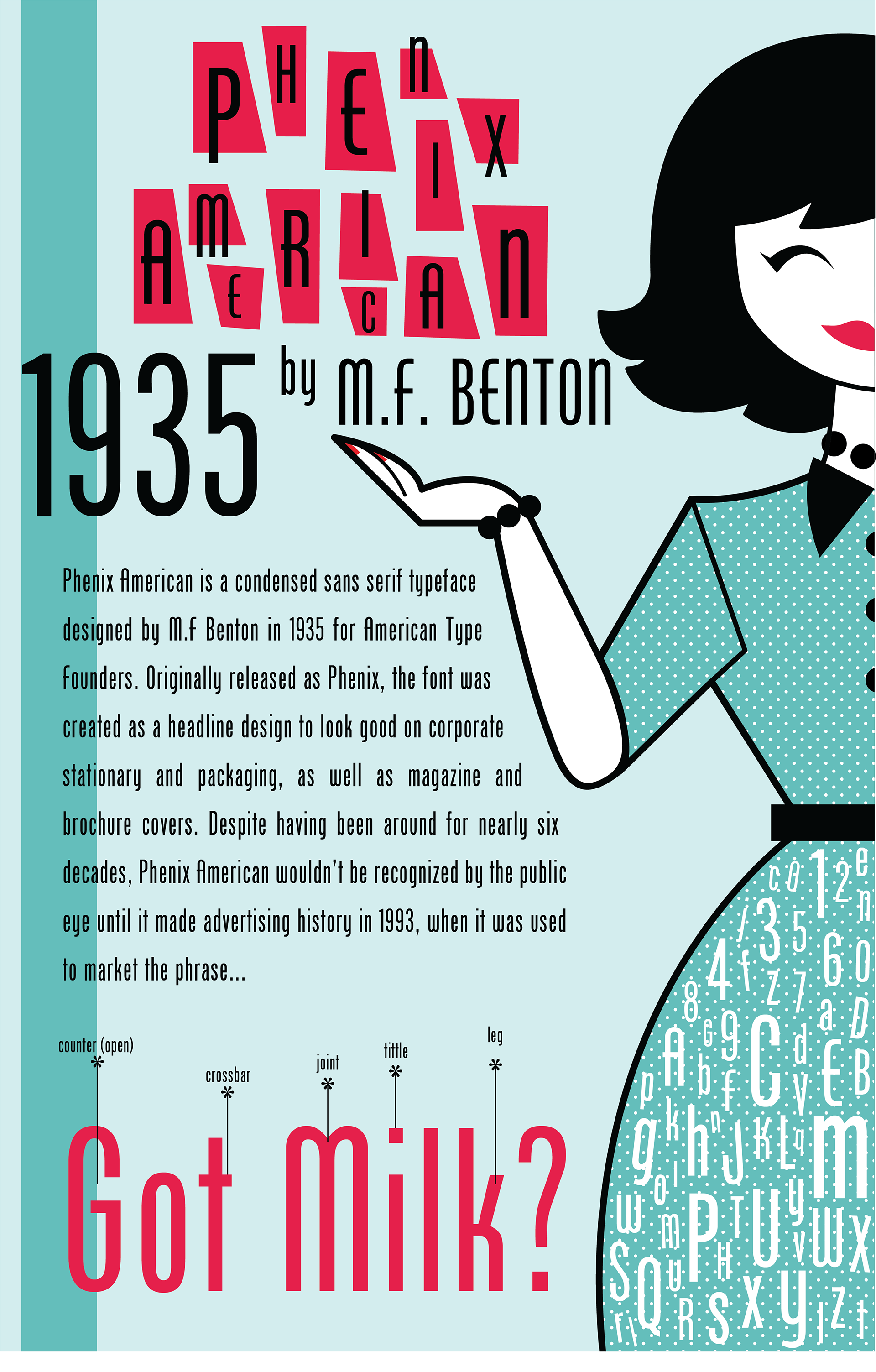
This type poster served as my first real exercise in layout and visual thematics as a digital designer. The assignment was to design a poster that showcased a single typeface, and required the inclusion of the year the typeface was created, the name of its creator, a paragraph of body copy, typographic anatomy, all twenty six letters of the alphabet, and numbers 0-9. In selecting a typeface for my poster, I was immediately drawn to Phenix American’s mid-century modern aesthetic. Throughout my creative process I researched mid-century advertising and sought to encompass visual trends from the era in my final design.


