Heat Waves
BRANDING • TYPOGRAPHY • PACKAGING DESIGN
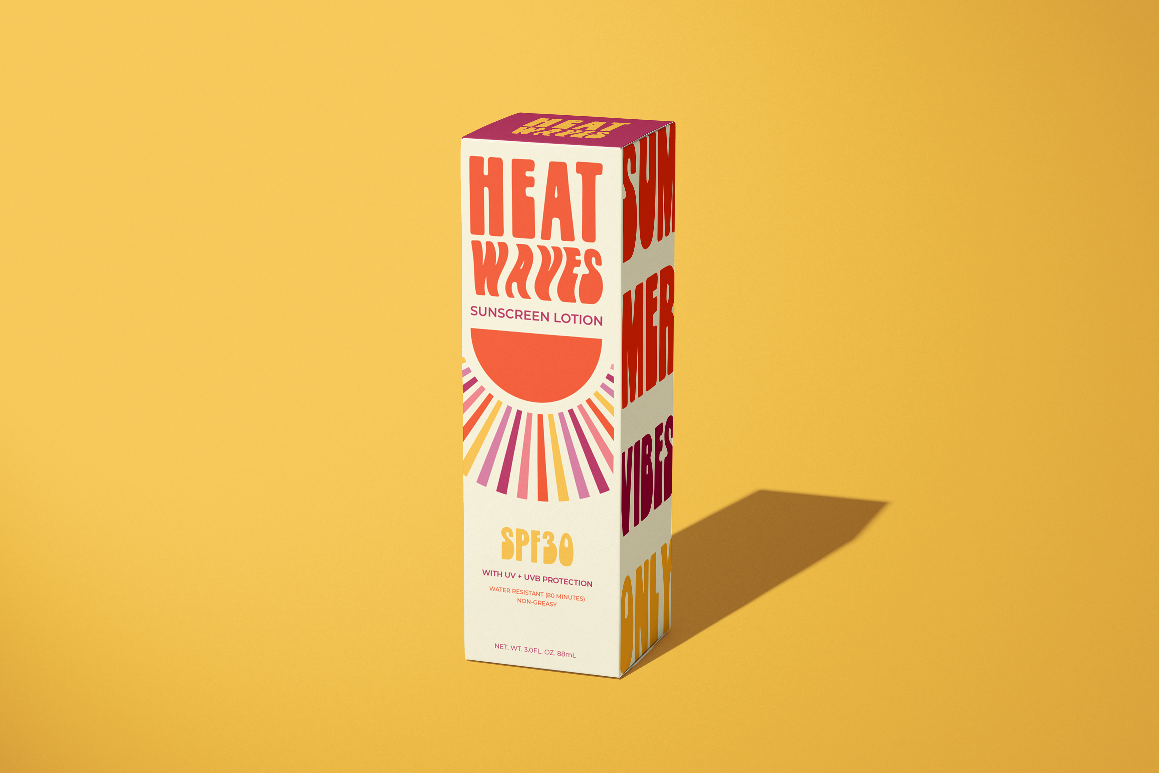
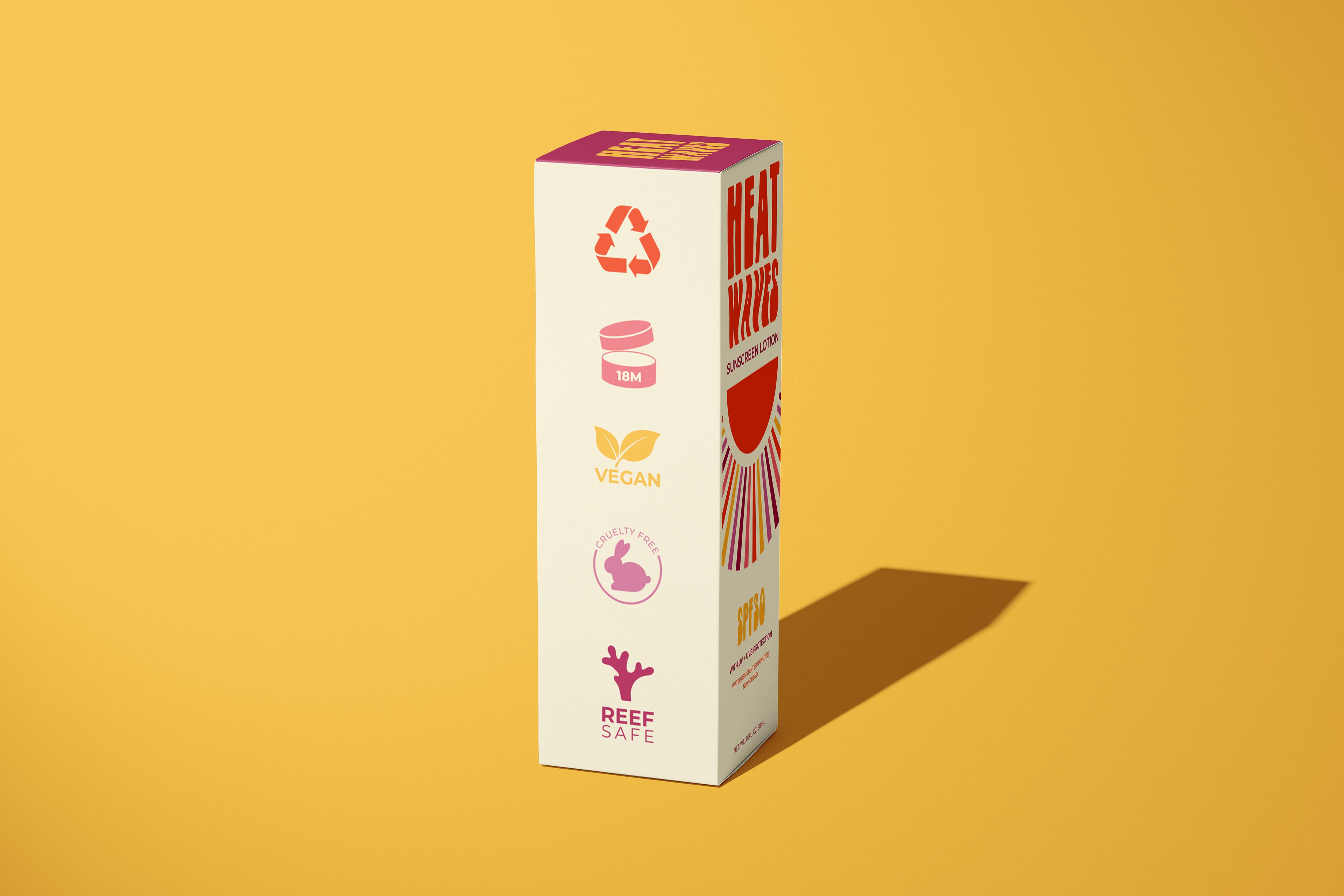
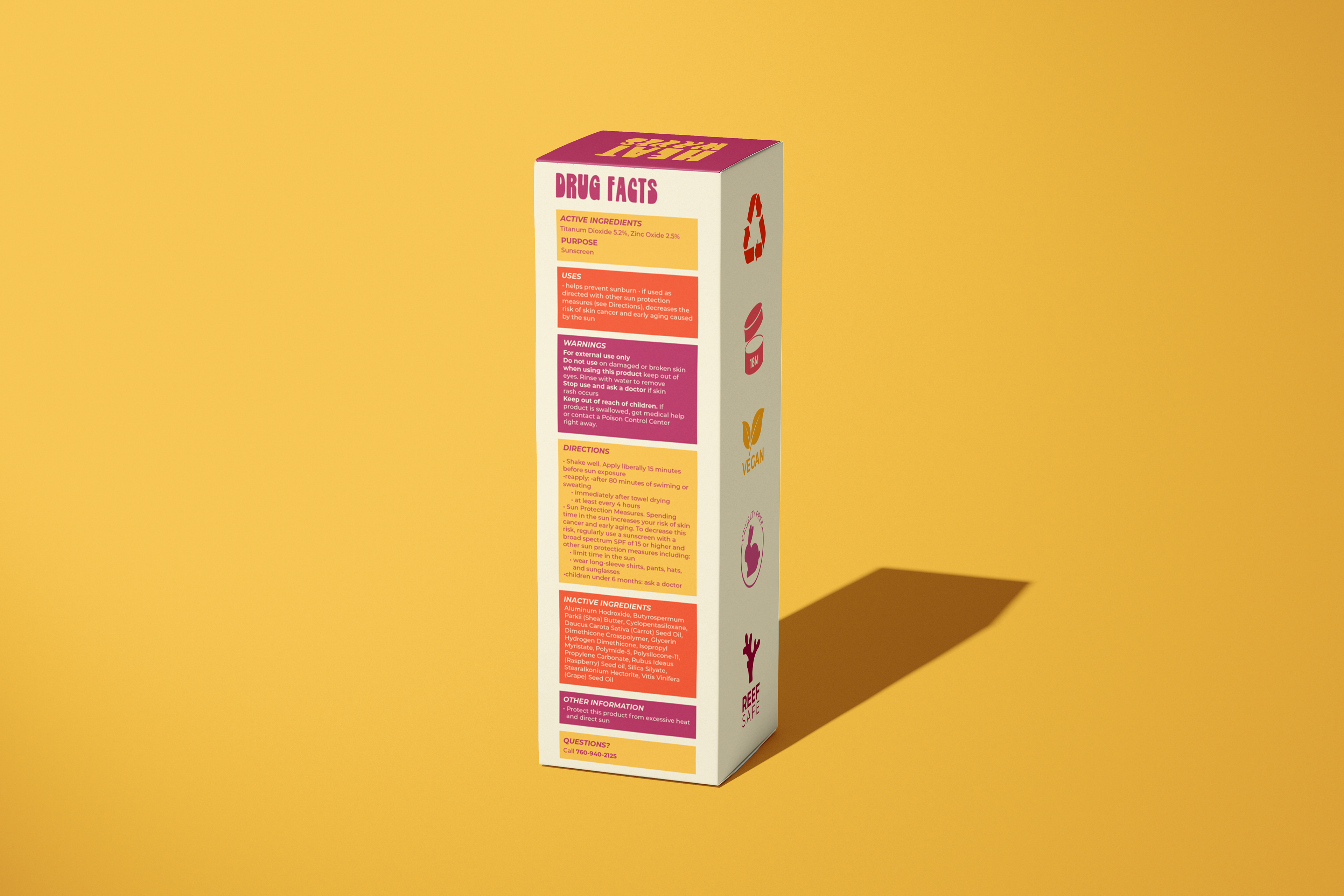
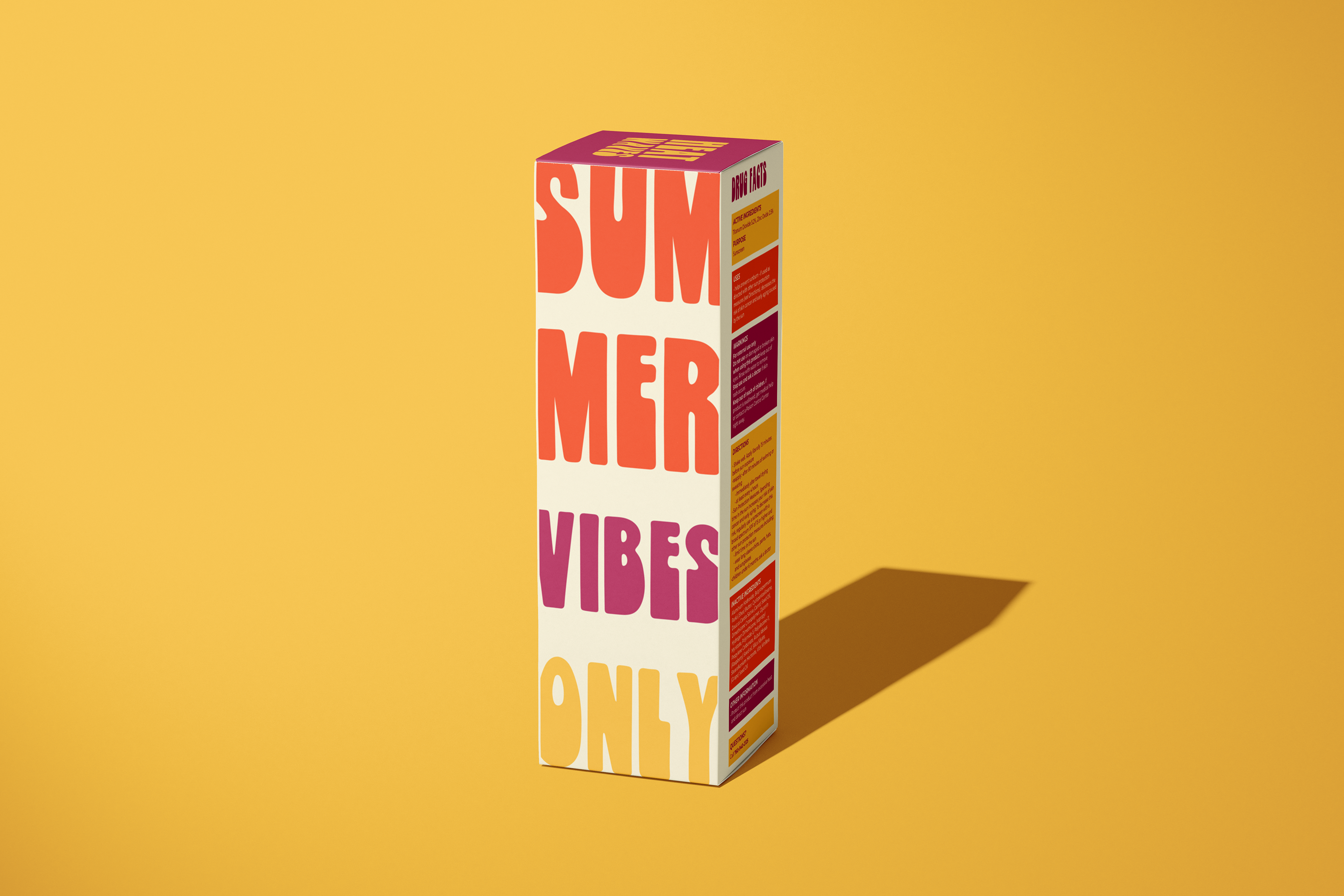
Heat Waves is all about branding and paying close attention to the details in packaging design. The project was to create packaging for a fictitious sunscreen brand, incorporating everything you'd expect to find on a cosmetic package, from an eye-catching logo and tagline to detailed drug facts. Inspired by the Glass Animals song of the same name I chose warm, vibrant colors and bold typographical elements to sell an upbeat, sun-kissed feeling of summer.
